ace workboots
Identity & Branding
ACE needed a brand that could stand next to Wolverine and Caterpillar without looking like a knockoff. I built an identity that felt rugged, simple, and ready for the premium work boot aisle.
Identity
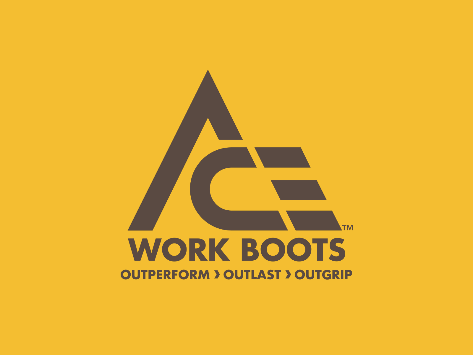
The mark had to feel tough without trying too hard.
I started with ideas around ascent, strength, and outdoor durability, then shaped them into a clean “A” icon that could work across packaging, hang tags, soles, and the boot itself. The final system felt sturdy, practical, and easy to spot.


Packaging
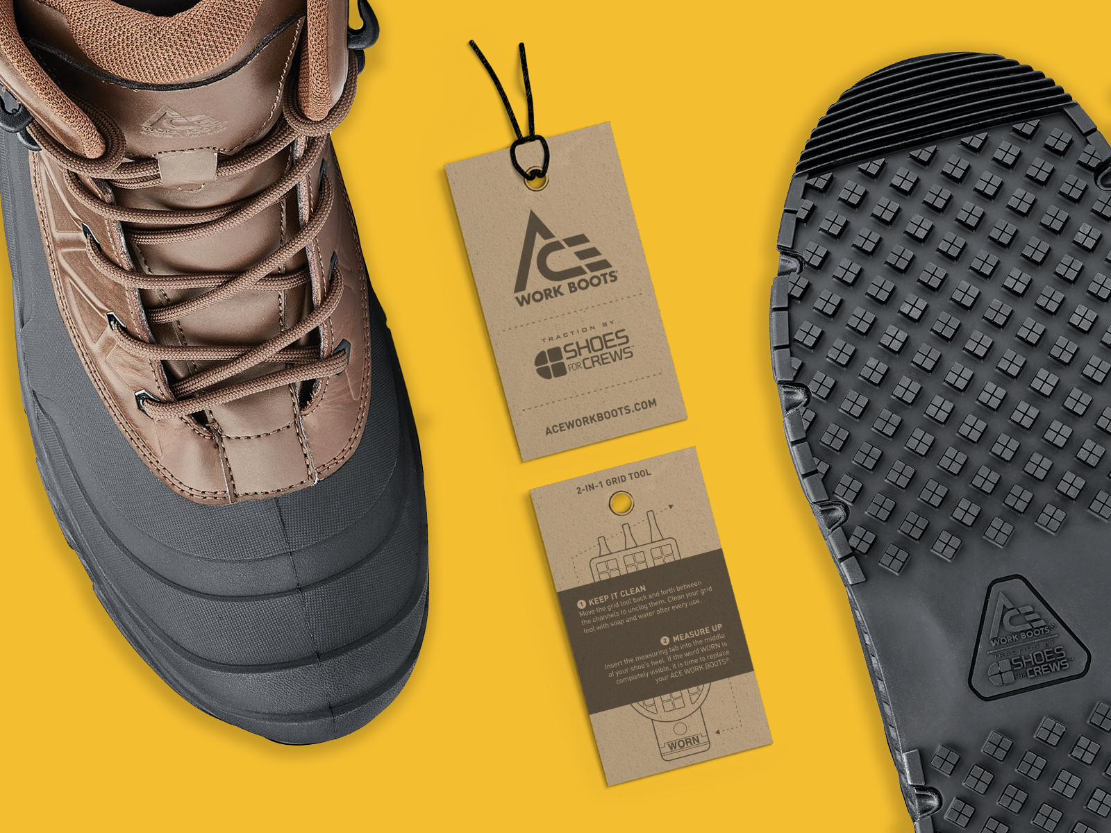
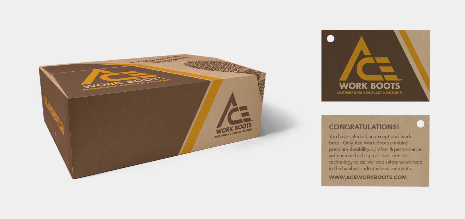
The box became a key part of the brand.
I developed a packaging system using warm brown, safety yellow, and black to give ACE a rugged look without making it feel muddy or overdone. Hang tags, box graphics, outsole details, and product inserts all worked together to make the line feel retail-ready.

print & Digital
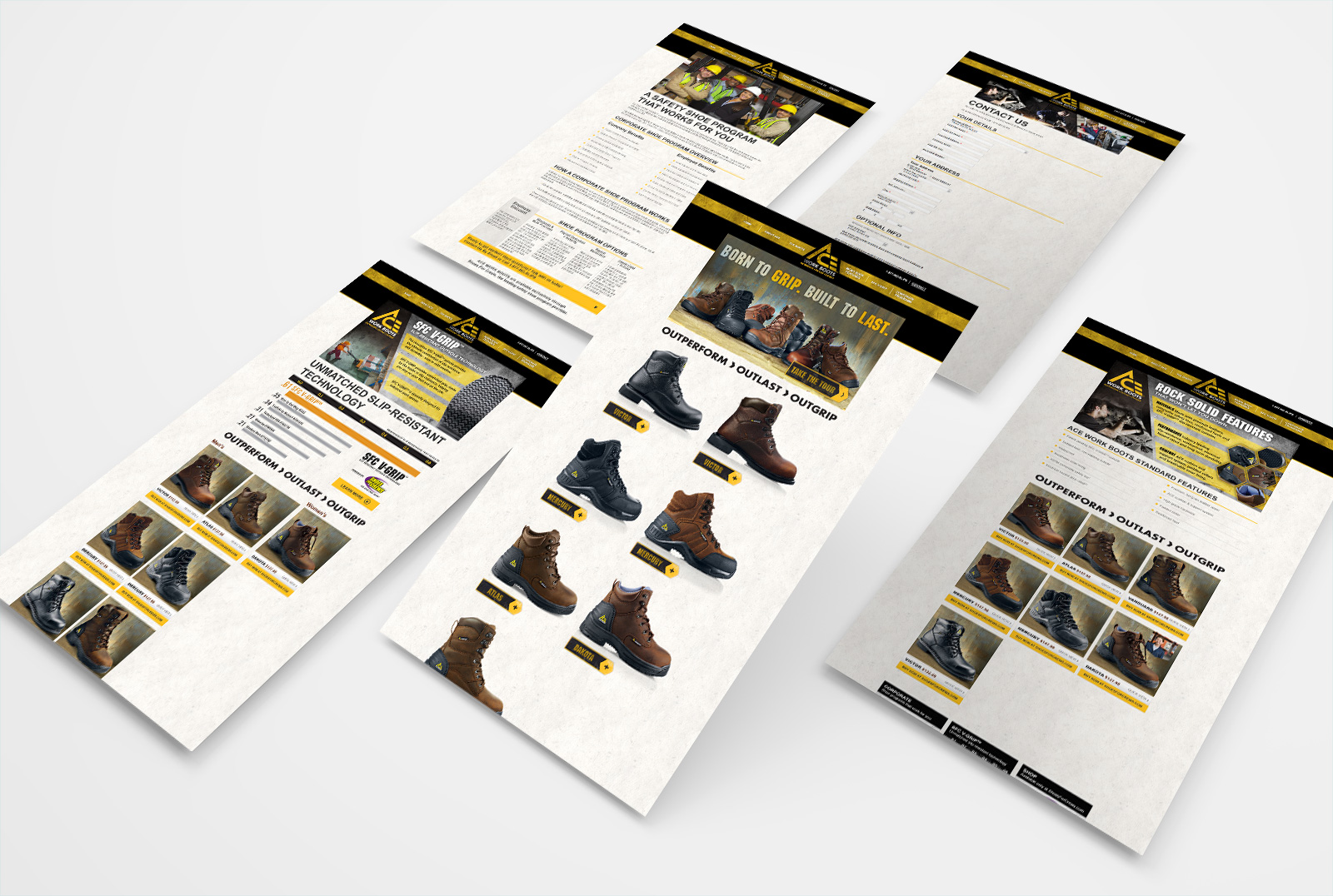
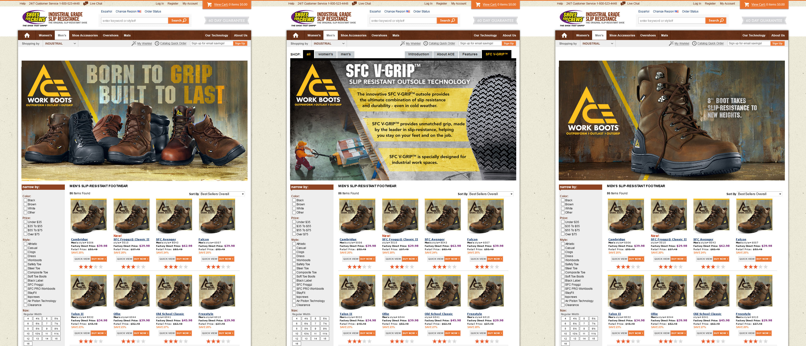
I extended the ACE identity across catalogs, microsites, and ecommerce tools that supported both retail and B2B sales. Sharp angles, warm neutrals, safety yellow, and clear product storytelling made the line feel rugged, organized, and ready to sell.
See the latest ACE Workboots website design as part of the Shoes For Crews rebranding and ACE Work Boots product update. Featuring my original identity, elements and color scheme. www.aceworkboots.com