KRMA Foods
Brand Build to retail launch
KRMA Foods is a premium bakery brand built from the ground up. I created the identity and the full system behind it, then took it to market, DTC packaging, retail labels, product photography, and the assets that put it on QVC and Sprouts shelves. From concept to a brand ready to sell on national TV and in stores.
Identity
The identity needed to feel polished without losing the brand’s heart. I built a visual system around soft pinks, warm neutrals, clean typography, and a lotus-inspired mark that gave KRMA a calm, memorable look across packaging, digital, and print.
Working with Steve was an absolute delight. Steve immersed himself in KRMA Foods in every way possible to understand the brand, the people, the culture, and the mission, then helped take us in directions we never thought possible.
Steve’s ability to execute on a vision and bring a brand to life was just one of his many strengths. He could tackle any project given to him, whether it was programming, redesigning the website, creating apparel, building custom sales decks, developing mock packaging, labels, and more. He knew how to get it done and always took on whatever he could to support the team.
His creativity and collaboration were essential in helping the team succeed. His sense of humor, professionalism, and dedication are unlike any other, and anyone who gets Steve on their team will be lucky.

Rachel Oostman, Co-Founder,
KRMA Foods


digital
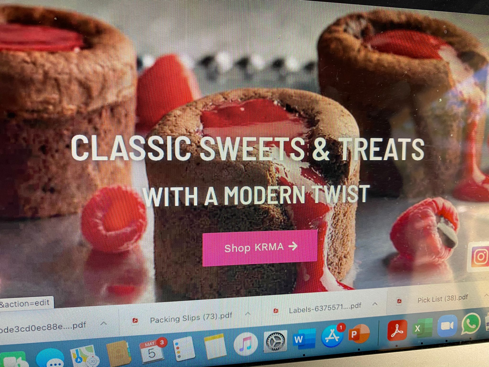
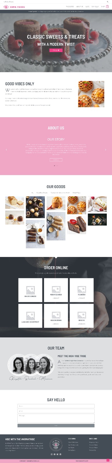
The digital work brought KRMA’s playful bakery energy online. I designed web layouts that paired product photography with bright calls to action, simple navigation, and a warm visual style built around classic sweets with a modern twist.
Website shown for reference. I created the original KRMA Foods brand identity and digital direction, but I no longer manage or design the current website, so live content and design may have changed.


The print materials gave KRMA a polished sales tool for wholesale and customer conversations. Menus, sell sheets, and product pages used the same bright color system and pastry photography to make the line feel organized, premium, and easy to understand.


DTC Case Pack
The DTC case pack was designed to feel more like a gift than a plain shipping box.
I used the KRMA mark, pink wraparound bands, and copy space for shipping label to create a delivery experience that felt bright, intentional, and connected to the bakery’s personality.


KRMA for Sprouts
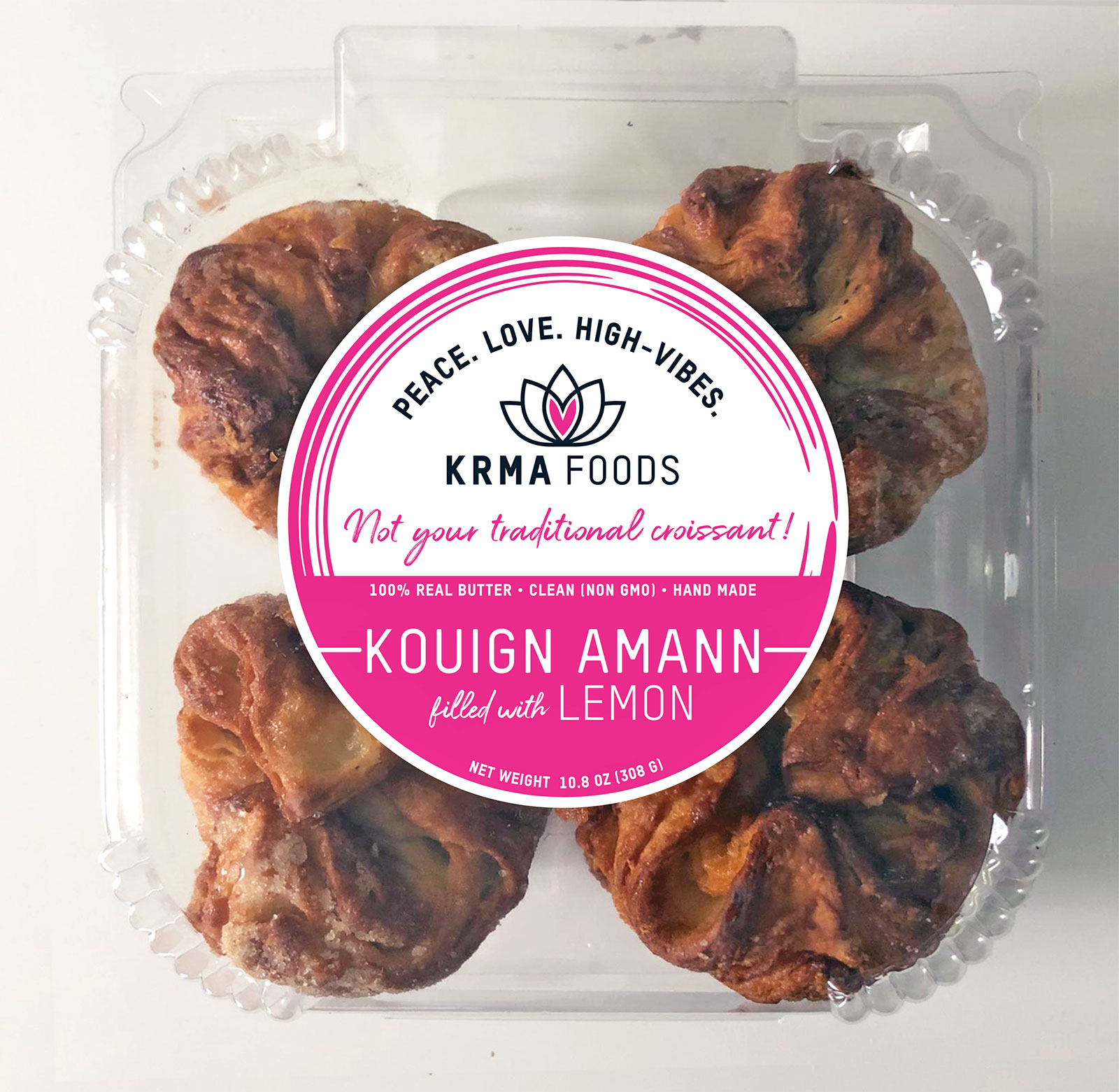
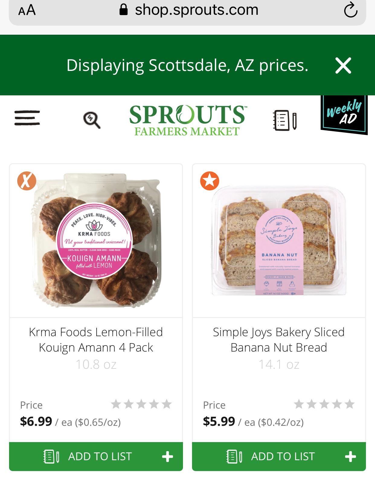
For the Sprouts launch, the packaging had to stand out quickly while still feeling natural, fresh, and bakery-made.
I adapted the KRMA identity for retail labels, product photography, support graphics, and online shopping assets that helped the pastries feel clear, shoppable, and ready for the refrigerated bakery set.

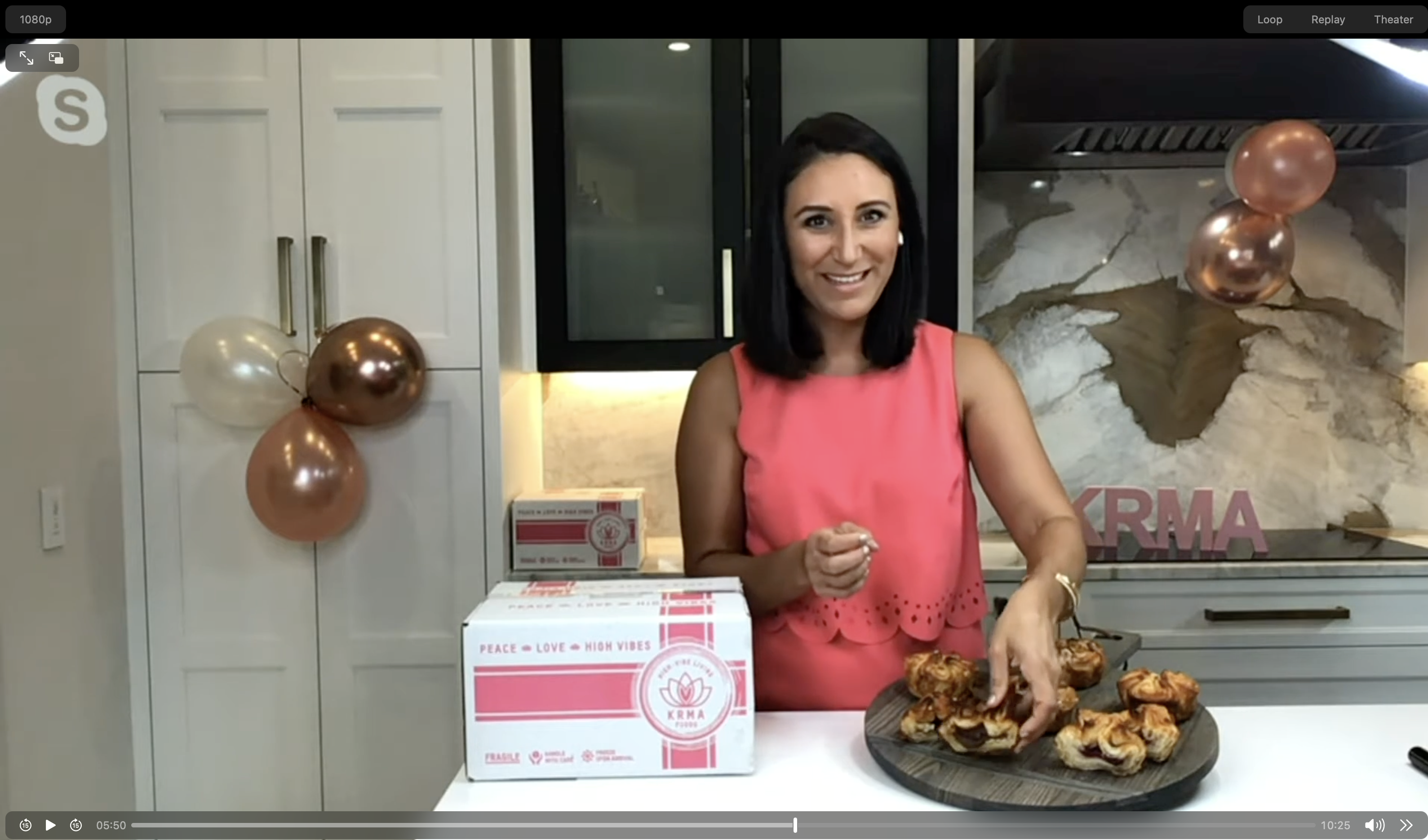
as seen on QVC
KRMA’s QVC launch needed to feel polished, shoppable, and true to the bakery’s personality.
I connected the packaging, product photography, shipping materials, and presentation visuals into one clear sales story for the on-air moment.