Cycle Werks
Identity & Branding
Cycle Werks needed a brand with more attitude than the average bike shop badge. I built an energetic identity that carried across the logo, website, apparel, and mobile repair van.
Identity
Most bike shop logos in the area looked like they were built for engineers, not riders. Lots of gears, hard edges, and serious “performance” energy.
Cycle Werks has a different personality.
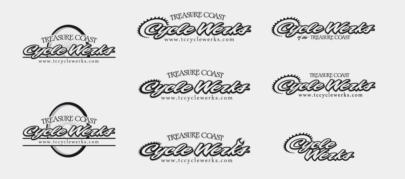
I pushed the identity in a friendlier, louder direction, something with more grin than grit. The final logo kept the cycling cues, but added movement, color, and a little swagger so the shop felt friendly, memorable, and ready to roll.

digital & Print
Cycle Werks needed more than a logo dropped onto a few things. They needed a look that felt fast, local, and a little loud, the kind of brand that makes sense on a bike shop window, a phone screen, or a business card handed over after a tune-up.
The digital work kept things sharp and easy to use, with bold contrast, punchy product images, and a mobile layout built for riders who are usually checking things on the go.
For print, I leaned into the same black, white, and yellow system, keeping it clean but not boring. Business cards, web graphics, and branded pieces all had the same job: make Cycle Works feel legit, memorable, and ready to roll.


Mobile Bike Shop
When Cycle Werks put a bike shop on wheels, the van couldn’t look like an afterthought. It had to pull up loud, explain the service fast, and make riders think, “Yep, these are the people who can fix my bike.”
I created the vehicle graphics from customer-supplied photos, building a properly scaled vinyl layout for the black Sprinter van. Big logo. High contrast. Quick service cues. No guessing what the van does or where to book.
The result was part service vehicle, part rolling billboard.
At races, rides, neighborhoods, and events, the van gave Cycle Werks a moving storefront that felt sharp, useful, and impossible to miss.


team gear & brand apparel
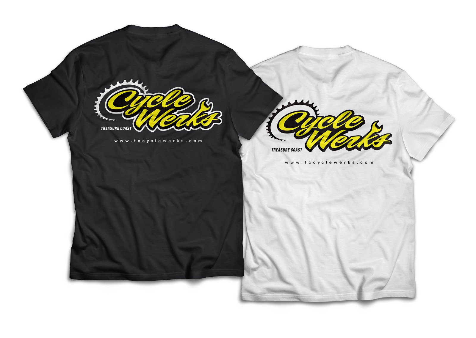
The brand needed to show up on gear riders would actually wear, not just on signs, screens, and sales materials.
I extended the Cycle Werks identity into team kits, shop shirts, and branded apparel that felt like part of the cycling scene. The gear kept the same black, white, and yellow punch, but each piece was built for a different job: race-day visibility, shop presence, team pride, and everyday wear.
Not merch for the sake of merch. Gear people would actually want to put on.